UNFINISHED BUSINESS

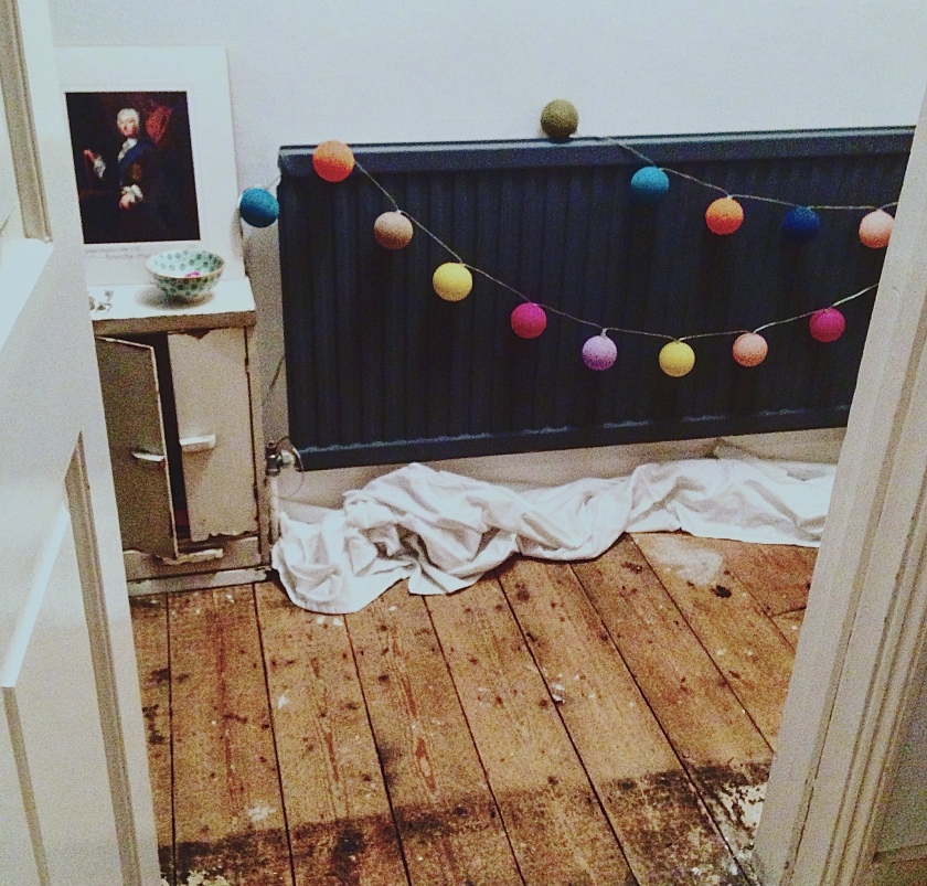
When you are decorating, renovating, or just rearranging a space, it can be quite tempting to stop before you’re finished, sometimes deliberately, for aesthetic reasons. I recently tackled the hallway in my new house. It’s narrow, uninviting and slightly dark, so I rather perversely made it darker so as to create the effect all magazines tell you will, by a comparative process, make the rooms off the hall seem lighter. I’m not entirely convinced this has worked, and I remain committed to the white wall as a rule, but the dark inky hue in the hall has certainly effected a definite change; it looks somehow more professional, smarter and more expensive. But much as I admire houses that are professional, smart and expensive, I don’t really want mine to look like that. There is something so appealing to my eye about unfinished business. Discarded fabric, bashed up furniture, pictures leaning against walls ready for their debut. Of course, this does not extend to all aspects of the home; dirty pans, wet towels, dead flowers, pyjamas on the bathroom floor, can all be chucked out or dealt with sharpish. But sometimes, when you’ve smartened up a bit of home, like the smudging of the perfect eyeliner or the undoing of a few buttons on a shirt, the space can really benefit from a bit of imperfection. That is my excuse anyway, and I’m sticking to it til I finish the job.

Hallway

IN SEARCH OF LOST LIME

Some musing today on colour. I am in no way advocating a retreat from pastels. Pastels are useful as the mainstay in the home if you want to create light, capacious, open rooms and don’t have the luxury of oodles of space. But there is, as with many extremes in life, a fine line that must not be crossed if one is to avoid certain faux pas. In life, for example, it’s advisable not to be too self-serving so as to retain empathy for others. Or not to be too modest so as to ensure authenticity. And so with rooms, it’s best not to wash the whole thing out with light. I know it’s confusing, because ten years ago, this was the right thing to do*. But life is confusing, and the right thing to do is not an immovable target on life’s immense spectrum. What a light, airy, pastel-hued room needs are a few pops of colour. Acid, bright, boundary-breaking colour that you would never ever wear unless you were fancy dressing. Mango orange, lemon yellow (as in deep yellow, rather than the pale dijon mustard colour the misnomer often suggests), royal blue or Indian Ocean azure. A good pop of colour jolts the picture, adds excitement within a wash of good taste, like an offensive drunken guest at a bland dinner party. Don’t spend too much time or money deliberating on the items though – if one thing is fixed on life’s perplexing continuum, it is that nothing is fixed. Proust would have us believe that art can conquer time. Well he never bought a neon yellow coffee table in the Habitat sale.

*You might even have hung a stuffed fabric pastel heart on the wall. It’s OK.

Regency chair: ENO, White chair: Mary Magdalene Foundation, Coffee table: Habitat, Striped rug: Mary Magdalene Foundation, Small bowl: Jackie Giron, Green beaker: Brixton Road charity shop

Regency chair: ENO, White chair: Mary Magdalene Foundation, Coffee table: Habitat, Striped rug: Mary Magdalene Foundation, Small bowl: Jackie Giron, Green beaker: Brixton Road charity shop